Research your competition
Hello Charlie – (Home | Hello Charlie)
Anywhere in the UK is scattered with different media production companies to choose from, so anything any company can do to stand out from the crowd is necessary. A website is a good place to start, as it is where most of your clients will start. A website needs to be easy to read and while also containing all the valuable information you want to get across to potential clients, it also needs to be easy to navigate, I found while researching for my Visual Investigation (Music Video) that the Berlin Music Video Awards website seemed outdated, and I found it hard to navigate to find the information that I required. Starting with a south west production company called ‘Hello Charlie’ who specialize in VFX, what I have initially noticed about this company is that they try and show big brands they have worked with, this helps to show the client that they are a reputable company, and makes us think that they have ongoing work (when really they might not) and good relations with these big names. When you first land on their site you are initially greeted with a homepage that adapts and fits whatever size screen you are using, you cannot scroll down this page whatsoever, this is not common for any website and I certainly have not seen it before, you are able to see the footer and the header of the page all in the same ‘window’.
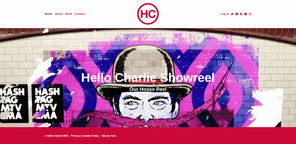
The centre piece is in the scrolling banner they have covering the width of the page which shows things they have done previously there are ten different ‘slides’ which it scrolls through with the first one being a link to their showreel. This gives me the impression that they do not want you stay on this page for long but instead want you to navigate and make your wat through their website, I think therefore the scrolling banner in the centre of the page is so big. So that you wait until you see something you are interested in and then click it to be taken to the page. Throughout the full site they keep the colours quite simple and use: red, white, and rarely but also black in some places, this helps to keep it all on brand. White is commonly used for the background; red is used for logos and text and black is used when hovering over buttons before they are pressed.
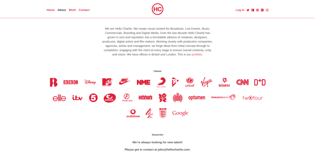
The ‘about’ page continues this same theme of being very brief and the colour theme I discussed above, they have a short paragraph about what they do that is different and how they stand out, this is also commonly different because most companies would have a big page about their story and how they came to be, but it seems like ‘Hello Charlie’ has what I would say a ‘no messing about’ work ethic, and want to work with people rather than tell them about something they may not even read anyway, this is made apparent by the hyperlink to their portfolio at the end of the paragraph, continuing with the colour theme below this paragraph they have the logo of any major company they have worked with but in the same red, this is obviously something that I wouldn’t be able to create and put together immediately but over time you could add to it.

I would say the strength of this site is its way of pushing you towards what the website creator wants you to look at, in this case it seems like they want as many people as possible to see their portfolio because it is linked on so many pages. They also want to get across how big of a company they are by showing the viewer the major labels they have worked with. The only weakness of this site in my opinion is that it isn’t a normal site and isn’t what you expect when you click to view it on google, for example; when you are on the home page you cannot scroll whatsoever which most people would expect of a homepage, this might put some people off or it might drag viewers in, I just think it should be at least scrollable because that’s what you expect of a website, all of the pages throughout are very brief and don’t give you tones of information which is a good and a bad thing but it depends on your opinion, some people like reading and some don’t, but if you can get all the information across in a short amount of text then that is perfect.
South West Film – (Video Production Company Bristol | South West Film)
South West Film sticks to the template of a much more generic website with a big banner at the top with the main product. In this case they are offering a video production service instead of a purchasable product, so they have substituted this to a picture of a camera instead, which was a good decision because the service is heavily revolved around cameras. Unlike Hello Charlie, they do not initially try and get you to watch their showreel with every corner you turn. Instead, they have a link to it in the header of the site which is good because it gives you the option to watch it when you want to and is very easily noticeable should you want to watch it.
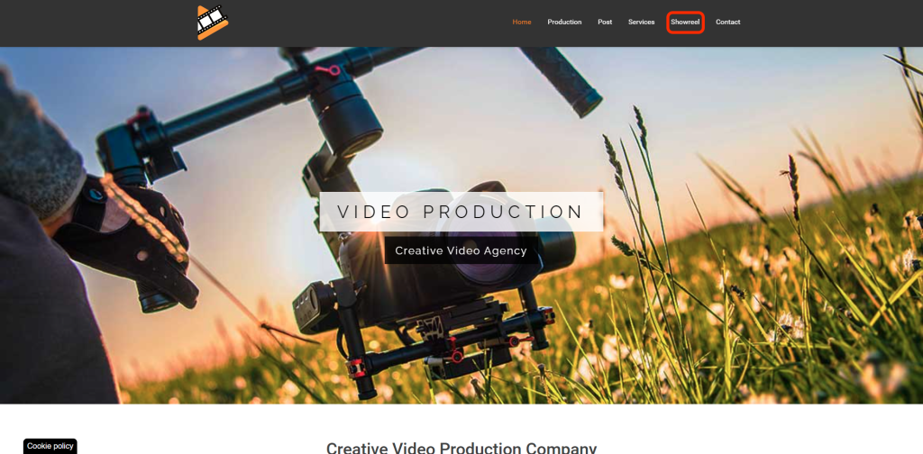
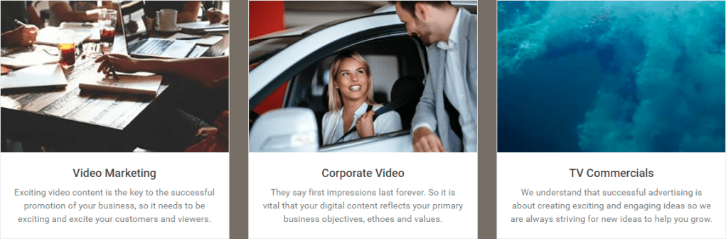
Scrolling below this main banner in big text it says exactly what they are, this is good because if you aren’t looking for a ‘creative video production company’ you can just click away from the website and find an alternative that suits you needs, this saves time and gets rid of timewasters, and even better below this big text there is smaller text saying how they will do what you need, they do this because they have got the customer to either decide if this is something they need or don’t need so then they give you an in-depth ‘convincer’ that they are the company for you. Something I do not like on websites is stock images, personally they look cheap and tacky especially when you are a film/photography company I do not think you should be using such images. They seem to use these throughout. I have also found another company called Aurora who use ‘mostly’ the same website apart from some of the pages. Aurora is in Plymouth and South West Film have an office in Plymouth so maybe this is a technique they use, by having multiple different brand names in various locations it may allow them to reach a wider audience.
They seem to use these throughout. I have also found another company called Aurora who use ‘mostly’ the same website apart from some of the pages. Aurora is in Plymouth and South West Film have an office in Plymouth so maybe this is a technique they use, by having multiple different brand names in different locations it may allow them to reach a wider audience.
Unlike ‘Hello Charlie’ this company lets you find information out yourself instead of forcing it in your face, to me it seems as if hello Charlie only had the one office space but by scrolling to the bottom of the page, we see that they have multiple various locations they operate in ranging from Bristol to Birmingham. There are pros and cons of this website, the main pro of it being that the main page is scrollable which is what I expected from a website. However, I think the deign aesthetic is not as pleasing as is uses dull colours like brown, black and orange. This website seems much more like a bog-standard website that has used a template.

Round One Films (ROUND ONE FILMS)
Finally, Round One Films are a company based in Plymouth, and out of all three websites I have analysed today this one appeals to me the most and makes me want to purchase the service. The first thing you see when you go to ‘Round One’s Website’ is a nice blue background with a camera situated in the centre of the frame, with the words ‘video production’ written in big bold writing with some smaller text in the upper right saying, ‘south west,’

The site is also a dynamic website and different elements move independently when you scroll, underneath this they tell you about themselves. Similarly, with the ‘Hello Charlie’ website they have a section dedicated to the different companies and big names that they have worked with, they have taken a remarkably similar approach in the sense that the colour of all the logos contrasts to the backdrop.
Round One must have edited these logos to make them all white as some of them could have been black or multicoloured, but it would be worth the effort as it makes the site look exceptionally clean and fresh. Below this and the last thing we see on the home page is testimonials or complimentary reviews that they have published. Although it is good to receive good feedback, we need to remember that they are obviously and any company for this matter will not publish bad reviews on their own site, for this you would have to go to a third party.
A page they have on their site is called ‘services’ which I have not seen on any of the other two, put simply this describes the different types of work they offer and a quick description below. This is good because it could help the client decide what style or type of video they might desire. This site is perfect because it includes both the pros from the last two without any negatives, it manages to remain brief while still retaining a great amount of detail. The website feels responsive with every page you go through, and still gives you all the information you came for.


Throughout this primary research and analysing these different websites, I have some mental bullet points now of how I want to create my site and different elements that I have or have not liked from these three will or will not be included when I create my own mockup website.
Devise your own new Media Production Company
When starting a company, it is important to start small and work your way big. For example, one of the biggest retailer’s ‘Amazon’ started as a book company, and I can imagine that they never expected to be in the position they are now operating globally. So, starting your business small and working your way up expanding as you go seems to be a method that works rather than trying to cover all aspects of media production at once. To start with I would begin producing short films and music videos for clients, this way they can then see what type of videos you make and if you do them well or not, and further down the line within the business you could start making full films if the short ones worked well enough and people are happy with the product you produced. You could also do side jobs to help generate extra income under the business, for example: aerial photography is a skill that takes time to learn however after you have you can earn good money from it, to help build the brand bigger, eventually when the business grows bigger and bigger you would want to cover all aspects of media production eg: short films, full feature length films, advertising videos and corporate videos etc, but I can’t see this being possible when you are starting out as a small business. As I saw when researching different website designs, some companies separate their different production sectors and run them under different names, so they are differentiated. So even though it is the same group of people operating different companies having them called different things makes the customer think that this is the company for them because the name is more applicable.
You could also do side jobs to help generate extra income under the business, for example: aerial photography is a skill that takes time to learn however after you have you can earn good money from it, to help build the brand bigger, eventually when the business grows bigger and bigger you would want to cover all aspects of media production eg: short films, full feature length films, advertising videos and corporate videos etc, but I can’t see this being possible when you are starting out as a small business. As I saw when researching different website designs, I found that some companies separate their different production sectors and run them under different names, so they are differentiated. So even though it is the same group of people operating different companies having them called different things makes the customer think that this is the company for them because the name is more applicable.
Name:
I had been recommended by a friend to use a site called ‘namelix’ which would generate a company name, however I found this to be a real struggle because it used common ending for example ‘von’ was used at the end of a lot of company name’s however this sounds too much like ‘Avon’ which is a vastly different company to the one I may start. The website also clearly uses your location without asking before, as one of the company names was ‘Torrinton,’ when there is a small town called ‘Torrington’ very nearby to me.
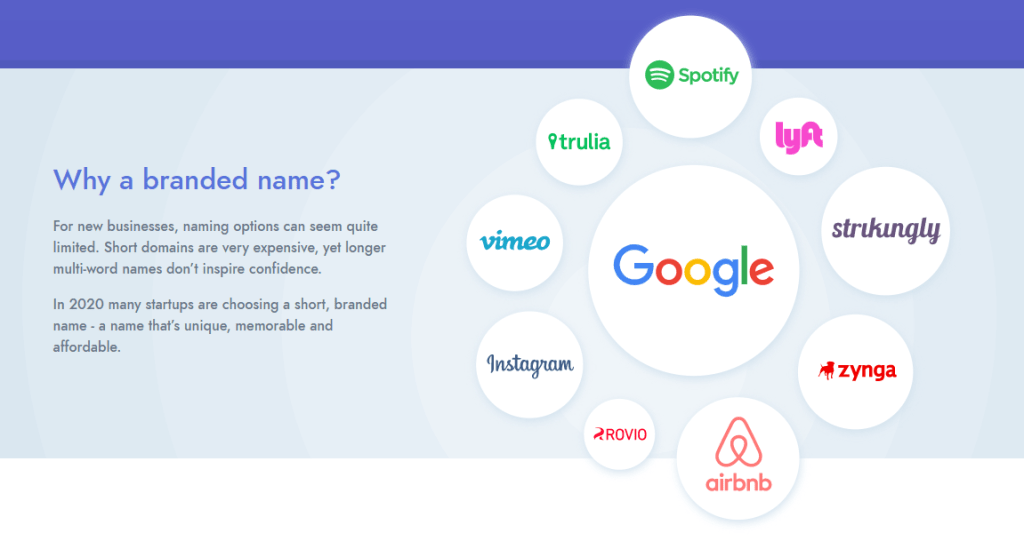
The only name that really stood out to me was ‘Exmourst’ which appealed to me because of the length and the meaning behind it. The ‘ex’ could stand for Exeter or Exmoor and the second half ‘mourst’ does not really have a meaning when I searched for it however it sounds like more and moor is a positive word and overall, it does not seem like a bad name. If I were to use this name at the moment I am unsure whether I would call the company just simply exmourst or exmourst media, I feel like adding media at the end gives the company a ‘sector’ as such and people would then assume it’s a media company straight away, where this isn’t as apparent with the singular word, but at the same time I feel like there are many companies which end with the word media and if I were to start a company I would want to stand out from the crowd and have a different name, so adding media at the end has its pros and cons.
The three different media companies in the south west which websites I analysed all had different names. While all being successful, ‘Hello Charlie’ is a name which does not relate to a location or tell the reader anything about the company whatsoever, it seems pleasant because of the ‘Hello’ at the start of the name which is a good touch and thing to have. ‘South West Films’ fulfils all both of the things previously mentioned; it tells you the location where the company is based and the area that they cover and tells you what the business does, which is ‘films’. Finally, ‘Round One Films’ contains the product but not the location. This makes me consider weather containing the information in the name of the company is necessary and if it adds to the company, or if it could make the company seem cheaper, because the industry is overwhelmed with the amount of companies with the placement or location in the name.
I think the name I have produced now is good because I think it’s definitely ‘brandable’ and by this, I mean it’s not taken and that no other companies have similar names, and it is likely to stick in people’s heads and I think this to the extent that it will stick in your head more than ‘South West Films’ because it is so unique and innovative. I also think that the way of including a place name at the start with the use of ‘ex’ works well and will mean people recognise it as a local business.
Logo:
The website ‘namelix’ also gives some graphic templates of what the name could look like written as a logo, I have attached a few examples below.
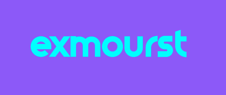
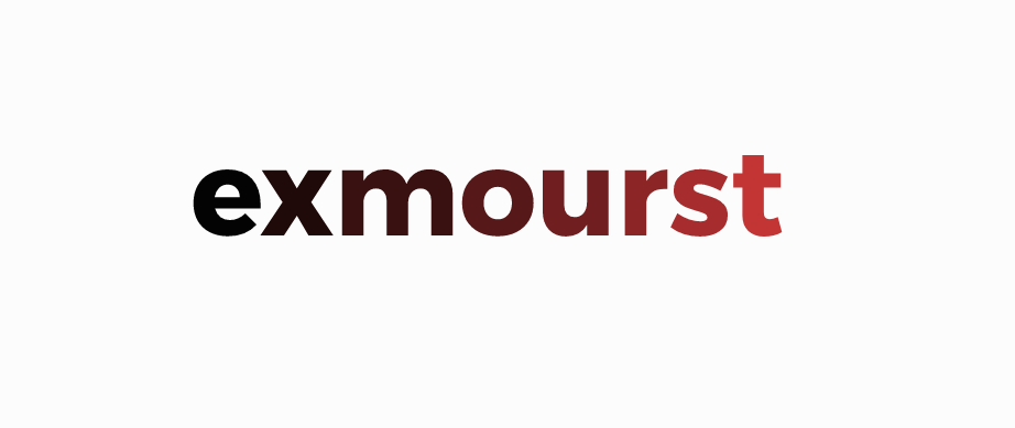
The one that I find most appealing and that catches my eye the most is the one on the left, this is probably because of the colours that are used; however, I do prefer the middle one in the fact that it is all in capitals and that it uses a fancy font graphic where it looks like paper is folded over on itself.
I would use the same or similar method like Google, so if you needed a square logo for a website icon for example just use the E from exmourst for that purpose, other than that I would write exmourst everywhere else.
It is especially important when looking at logos to make sure the colours of the text and background are continuous throughout the webpage, I also think that the best number of assorted colours to use is between three and four. All three of the websites I looked at had three. Even large companies like Google stick to this and in their logo, they use blue, red, orange, and green. Amazons logo sticks to this too. Using lots of assorted colours in your logo or webpage can make it distract the viewer. According to ‘99designs.co.uk’ a general rule of thumb is to use one light colour as the background, a darker colour for text and a neutral shade that goes with everything and finally, a colour that stands out to catch eyes. I would agree with these general guidelines as it has worked for many years for many big brands.

Google updated their logo in 2015 and their reasoning for doing so is this: “The Google logo has always had a simple, friendly, and approachable style. We wanted to retain these qualities by combining the mathematical purity of geometric forms with the childlike simplicity of schoolbook letter printing. Our new logotype is set in a custom, geometric sans-serif typeface and maintains the multi-coloured playfulness and rotated ‘e’ of our previous mark—a reminder that we’ll always be a bit unconventional.” (Google, 2015).
Mission Statement:
A mission statement is a short sentence or two to describe what the mission of the company is to achieve, most of the time these are only one line long and include some details as to what the company specialise in. Here are a few examples: Tesla’s (electric car manufacturer) mission statement is: To accelerate the world’s transition to sustainable energy, this is a good example because a Tesla car is known for its fast acceleration so including company characteristics could be a key theme, JetBlue an airline in the US’s is: To inspire humanity – both in the air and on the ground, quite clearly the ‘in the air’ represents the core business as an airline. It is also important for a company to change their mission statement; this is not necessarily because they feel they have achieved the goal they set out but more so because they feel that the goal has changed or that they need to focus on going in another direction to grow. Some companies just are not very appealing and uninteresting, for example American Express (bank) “We work hard every day to make American Express the world’s most respected service brand.” This does not really stand out to me because obviously you would expect a company to ‘work hard every day’. When creating my companies’ mission statement, I want it to stand out and to be interesting while still maintaining a short style.
Thinking about the primary research about other companies’ mission statements I have made a few mental notes about how I want mine to be; one line (under twenty words), to hint at what the company does eg use words like ‘produce’ or ‘create,’ to show that the company aims to achieve and move forward. Below are a few that have sprung to mind, I will then compare them and select my favourite.
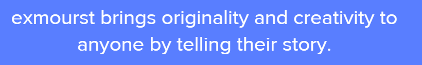
- Exmourst brings originality and creativity to anyone by telling their story
- Exmourst offers a unique videography experience for anyone, by providing the best short films and aerial photography
- Our mission at Exmourst is telling anyone’s story with innovation, creativity, and imagination
Out of the three different mission statements number two is clearly the longest by a few words. I am already ruling out three and this is because I do not like the list style is uses at the end, although all three words are descriptive and help show the reader what the company wants to achieve, I do not feel that it is necessary to include this with three words all together. Moving on to number two, I said before that I wanted the statement to be short, where this one is clearly not in comparison to the others, I also don’t like the fact that there is a comma separating the sentence as it makes it seem longer as well, however you can’t remove this because it would make it grammatically incorrect, so as you probably gathered by now number one is my favourite out of the three and this is because its short and sweet, it doesn’t get as much detail across as the other two do however I think it’s still a sufficient amount, I also like how it focuses on the client because it makes you feel like the company care about you as a client, this is the mission statement I have settled with: Exmourst brings originality and creativity to anyone by telling their story.
A brief outline of your Business Plan:
As previously mentioned, the work that I will start about doing is smaller projects, for example music videos and short films whether it be advertising for a company or if it is someone wanting to make a personal video for personal use. Also, in the beginning I plan to carry out drone work and like the short films this can also vary in the style or type, so instead of focusing on one ‘sector’. Only working on short films for advertising purposes narrows your target audience a lot, and especially in the south west of the UK few companies will be looking for this but widening it out to be any short film and just setting a maximum length of five- or ten-minutes means that it gives the client chance to think about what they want rather than giving them a very narrow selection of what they can have. Similarly, the drone work could be anything drone related, it can mean anything using the UAV (Unmanned Aerial Vehicle) so one day you could be doing a roof inspection for a cottage to find out where a leak is coming from, to getting cinematic shots for a film. So, in the beginning the company/business would start out offering these two (but very wide) services. Now, the clients could also be anyone, now there are lots of up-and-coming artists that could want music videos producing but this could be anyone that needs a music video. The client would first have to reach out to me via a website or Facebook as these would be my main two ways of advertising.
The budget for a short film can vary a lot depending on how much the client can afford to spend on the video, this could determine how well or the scale of the production and in some cases it will not because even some of the best short films have been produced on an exceedingly small budget. Online I have found a guide of how to budget a short film, and what the writer says is to be realistic and cost up what you think you will need to spend not what you hope to spend (Whinshall, 2016). So, the cut the production company takes from a short film can really vary: “A commercial production by Apple could cost upwards of $500,000 or a short-branded doc might cost $5,000. Video production costs will depend on the type of video that you need, the location, crew, equipment, talent, amount of pre-production, editing, sound, post-production, and more. The best way to estimate your budget or to get an accurate quote from a production company is to write a video production brief. A brief detail the when, where, what, why, and how of the video you want produced.” (Kovacs, 2018).
This is similar for drone work but for a different reason, some drone pilots and photographers operate illegally and without correct authorisation from the CAA (Civil Aviation Authority), a hobbyist that has a drone may be willing to take some photos for a much lower price of around £50-£100. Whereas if you employ a CAA registered pilot it would end up costing £150-£500 and this is because they are doing professional work (Drone Safe Register, 2018). The cost difference is so dramatic because to ‘commercially fly your drone’ (operate the drone with intent to gain money as a result) you need third party and/or public liability insurance so that in case of an accident you are covered and not left with a massive bill to pay, but hobbyist pilots probably won’t have this, however this does give an advantage to registered pilots because they can advertise the fact they operate legally, (I already have the correct insurance and licences in place to fly a drone commercially and legally). So, it is always best to check the flyer is properly registered and insured before letting them fly near your property or letting them work for you. Initially I would start of charging a low price while I am getting to grips with the cost and the ‘want’ for the service and then up the price when the jobs get bigger and more demanding for me as a pilot. So, per flight you should charge around £150-£500 depending on the severity of the job.
Investigate the Exeter based company Illicit Web design
As soon as you click on Illicit’s URL it tells you what they company do, in big writing on their home page it says ‘Web & Digital Design’ which well, is exactly what the company do. Like other websites I mentioned in the web research section, they have testimonies on their website of clients that have used them and one even saying, ‘We cannot praise them enough!’ (Heistercamp, no date). They also have what I previously called a ‘dynamic’ website where the page does not scroll like a normal page and instead different elements move in separate ways and orders. In the banner of their website there is a menu with a page dedicated to ‘What We Do’ in which they say that they will do anything web based whether it be e-commerce (online shopping), a simple website and any digital design or marketing so they do anything digitally your company could want apart from photography or videography. Illicit have a plethora of different companies that they have deigned websites for and maintain, the one at the upmost of their site is a company called ‘Roastworks’ who are a company that roasts coffee. They also have lots of different examples of different companies and the different services they used applied across them all, here are some of the different companies they have worked for: DCT8 (media agency), CODA (water-sports shop), Kingdom Creative (video production), Moor Consult (construction).

Illicit Mock-up Email
Hi Illicit.
I am enquiring to ask if you would be interested in designing and creating a website for my new start-up media business: Exmourst. To begin with the primary business for the company will be in short films of any style and drone photography/videography, I have been looking at other companies big and small and the websites they have. There are some elements that I like and would want to incorporate into my own and some which I want to stay away from.
First, I need the website to be responsive and quick as I want this to represent the way I work. This is important because having a slow website or one that after you have clicked the link on Google could make a potential client click away and take their business elsewhere. I would also like the website to be dynamic in a way that different elements move down/up different amounts as the page is scrolled through like Round One Films (ROUND ONE FILMS) site, this gives the website depth and a smooth motion.
The videography and media production industry are heavily crowded so another thing that I think is important is that there is not lots of text on the website, just enough to get my point across to tell potential clients what I do and why they should choose me. Also, I think that there should only be three different pages to the website a home page, contact page and thirdly a page showing previous work and about the company in general. This represents my views on simplicity and how an informative website should be effective enough in getting information across effectively. The pages should also not be long so that you could scroll down for miles, instead they should be around three screens long. I also want my website’s main page to have my portfolio big in the centre and to automatically play when the website is clicked on, to immediately show the client the good standard of work being produced, and for it to be paused if they scroll down the page, and resume if they scroll back to it, this will give them freedom to do what they like on the page.
I am excited for your response to see what we can create together
Thanks,
Brad – Leader at exmourst
Develop an Online Presence
Click the button to be taken to exmourst’s mock up website
In previous sections of my work I had already set out what different elements and the general theme and how I want my online presence (website) to look like, I think when I created my website I hit and included most of the things I set out to.
To create my website, I used wix.com, Wix is a free website builder. They allow anyone to build a website for free and they put insignificant things like a banner at the top saying ‘created with wix’. This is a good free option for anyone to use when getting into web development. Initially I set up my account with them using my college email address, as I already had a wix account with my personal email (and this website is for college use). To begin with I struggled to get to grips with wix, because everything was all automated and felt like they want to take control of the whole development process easier for anyone who does not know what they want. However, because of the research I had completed I knew exactly what I wanted out of my website, so after passing through all the automated stuff, I managed to access a more advanced version of their basic website builder where it would allow me to resize objects and do what I wanted too more freely.
The first thing I added to my site was the logo in the upper right corner of the header, along with the mission statement as this was not mentioned anywhere else on the site, by default the header was set to white which does not fit with the colour pallet I had in mind, and as previously mentioned I only wanted to have three distinct colours throughout any text and backgrounds on the entire site. So, I changed this to the same hex colour code that I had previously noted down of the purple/pink that is also the background of the logo. I repeated the same process for the background of the website so that you cannot see the difference between the header and the main body of the webpage.
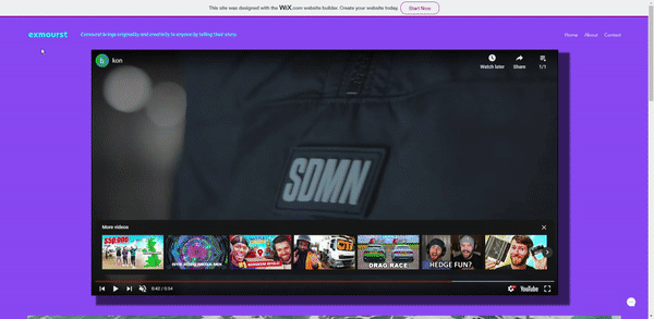
When creating the site I wanted the pages to feel as 3D and immersive as possible, and I did this in two different ways, on the main page you can see the main video that I had planned, which showcases what your video could look like in the hands of my business, and just behind it I have added a shadow effect to make it look like it is sticking out from the page, the other way is to add what wix call a ‘scrolling effect’ onto images, which I did on all three of my pages, to keep the continuity and to not feel like one page is more or less exciting than another. On the home page I added picture of waves crashing which zooms in as If you are riding the waves. I think this effect in general weather it be on my website or a competitor makes it much more exciting rather than a static image and could make potential clients stay on your site for longer.
On the contact page of the site, I decided to give the client the option to do what they like and give them diverse ways of contacting Exmourst, this continues the theme of having the site feeling ‘free’. There are three separate ways of contacting the first one being the contact forum that you can fill in and it will direct the email to the company (Exmourst), another option which I have seen on other sites, and this is not just companies offering a similar service to me but just any company in general is a ‘chat’. So, in the bottom right corner of the site there is a little chat button which lets you fill out your details and then chat to a real person (me) on the other end. When the details have been filled out it sends me an email letting me know someone is awaiting assistance so I can help them as soon as possible. Finally, the email address that all of this gets forwarded too is on the site, so if they prefer to just enter this email into outlook and compose the email themselves, they can do this also!
I also decided to create an Instagram profile for my production company so that it can be seen on social media platforms and to showcase my work. On Instagram the easiest way to find a profile is through their username which is symbolized by an @ symbol at the start. Luckily when creating mine the @exmourst was available so I created the page using the same graphics that I included on my website to keep it consistent, I also uploaded the clothing commercial I edited as my first post, this would help to show consistency and development within the production company and would always be nice to look back on as a first project or piece of work. While I was doing this I also created a twitter account that uses the same username (@exmourst) while it is still available, sometimes pesky people will see that you haven’t claimed the username on all social medias so they will claim it themselves and try and sell it back to you for a ridiculous price. In some cases, companies accept this because it is worth more to them to seem official by having their own username back. This helps me to develop an online presence not just as a production company business but also a brand, I have also posted the same video onto twitter.
Evaluate Your Work
To begin with I analysed three different companies’ websites who also offer a similar service to me and in the same area. I looked at how they are designed and specifically the distinct colour schemes they use to attract attention, by doing this it made me realise what I do and do not like about a website, and the different things I would do or change about them if I could. This means when I created my own mockup website I could add and not add different things that I did or did not like from the sites I looked at previously, and I had the freedom to add in anything new and that I had not seen before. I took notes of their strengths and weaknesses so I could use it to my advantage.
I think in researching different production companies based in the south west before looking and thinking about creating my own was a clever idea because it meant that I could process the different elements and it made my website better because I gathered the knowledge and information, I needed to make it good. I also decided to analyse three different companies instead of two I did this because websites can be quite different and by adding a third, I was able to get a wider comparison between three sites rather than if I had two that are similar. I did a decent job picking apart the three sites and found it valuable, I think I could have improved by looking more in-depth at how the websites were created and how they built them as this would have meant I could learn how they were created rather than focusing on how to create my own so much.
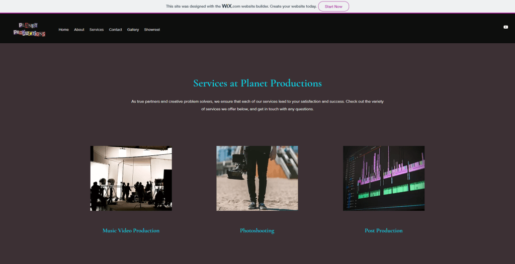
Looking at other students in my class’ sites now: starting with Oliver Stockman’s. His URL is: Home | Planet Productions (wixsite.com). The home page of the site, he has clearly shown use and created himself a colour palate so that he knows which colours to use in certain places throughout his site. Initially we are greeted with a sort of ‘about column’ telling the viewer what the company does, this is different in comparison to my site where I went for a more visual approach showing the viewer an example of some work rather than worded information. He has also used a header on the site which should make it easier to navigate, although I would change this horizontally so that the header is smaller (see below). He has also taken a similar approach where he used moving images as the page is scrolled through which generally makes it more interesting. Also, to further the online presence of the company he has created a YouTube channel where he will presumably upload examples of work and advertisement videos. It looks like there are some finishing touches need to be made but apart from that it is complete.

Moving onto Harrison Beer’s site and company which he has called ‘Exsports’.His URL is: HOME | Exsports (wixsite.com) His homepage is very impressive in my opinion. It is a sports pitch with the logo overlayed on-top and the background is fixed so when scrolling through the page it remains ‘stationary’. Past this it also shows the different services that the company provides, which are: photography, videography, and postproduction. Instead of different pages on his site Harrison has opted to use a feature where when clicking on the different sections in the menu on the header of his site, it automatically scrolls the home page down to the section. If I were my site, I would use these as separate pages, however that is just my personal preference. Overall, I think Harrison could use some examples of previous work but other than that it is an accomplished site.
ROUND ONE FILMS

SOUTH WEST FILM

HELLO CHARLIE
When thinking more specifically than just what I want the website to look and feel like and instead about how the company looks more generally, I found this more challenging because this is something I have not done before, whereas I have created websites in the past. I decided to just delve into two small different jobs (short films and aerial photography), and this is a promising idea for a small and just starting up business because it gives you the opportunity to expand and broaden later down the line rather than trying to carry everything on your shoulders at once. I would say the part I struggled on the most was thinking of a name, and this is the main reason I used the business name generator ‘namelix’ because I simply could not think of an option on my own, it may seem like using a name generator is cheating however I do not think it is. Namelix generates hundreds, thousands of different names and after looking through all the different ones I decided on one I was happy with, this still took some time. Just as much if not more than thinking of a name myself. The logo was pretty simple, namelix generates different graphics for potential logos however, you have to purchase these through their site which I did not want to do, so instead I took the exact same colours they used and put them into photoshop and ‘matched’ the font so I could find a similar one, I actually prefer the font that adobe matched as the lowercase ‘e’ at the start of the logo looks more like half of a smiley face compared to the progenerated one, this is why it is always good to look at other options (like fonts for example) because it may look even better. Both my logo and name are good, the length of the name is not too long, and the logo is just simply the name (as previously mentioned, like google) which keeps things simple which is something I wanted to carry across for my entire site.
When it comes to a mission statement originally, I did not know what one is, at first, I thought it was like Tesco’s famous ‘every little helps’ but a mission statement means more than this and is more about what the company sets out to do in the future, I wanted mine to include the potential client to make them feel involved even when they are not already; this could have helped to draw in more clients. I wanted to do this in a way that was aimed at the client but also not by saying ‘you’ or being too direct. So instead I generalised it and used the word ‘anyone’ because from a business point of view anyone is a potential client. I think that the result of the mission statement (Exmourst brings originality and creativity to anyone by telling their story) fits the business very well. I am glad I managed to achieve something for this section that I am incredibly happy with and that fits because it will help show passion behind the business and what were about. The outline of the business and what I had intended for it to do was simple, I had it in the back of my mind since looking at other sites, the more complicated side to this is was calculating approximate costs for the two different job styles I had selected as these can vary a lot; however, I managed to get down some approximate costs that applied well and gave an idea of how much it should cost. These costs were not just pulled out of thin air either and they were sourced from a reputable site, this would help a business know an idea of how much they should charge for the different work they are doing.
When researching illicit it was straightforward because most of the information about the company was able to be found on their site because as a good company, they want to boast about it and tell people about their company and what they do. To me I would say that this section of the research was the least helpful because in comparison to researching other companies’ sites would make anyone realise what they did and did not want, whereas researching a web development company did not seem to improve my knowledge or make me realise what I did and did not want out of my website. Although I did find composing a mock-up email to a website creation company (illicit) useful because it was an effective way of getting across what I wanted on my website and what I wanted it to feel like. It was useful also to practice getting a lot of information across in a small amount of words which is something I wanted to specifically do on my website. This was also helpful to refer to when creating my own site so that I could make sure I had not missed anything.
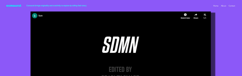
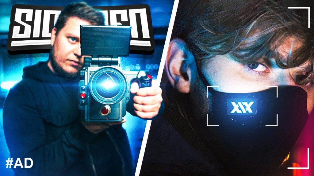
In part two we had to create and develop a website for our mock-up business that would be suitable and useable if we were to use the website for the business if it were real. It had to include all the relevant information, most of this information I had already decided upon and created, so it was more trying to incorporate these within the site itself, with the colour scheme I had decided. For the main page of the website, I wanted to have a big video that fills the main portion of the home page, and I did not want to use an early college project because these would be embedded onto other pages of the site as previous work. I wanted something that would stand out and impress anyone that clicked onto the site. I watch a YouTuber called ‘Konstantin’ (Kon) who is a video creator for a large UK group YouTube channel called the ‘Sidemen’. They also have a clothing line called SDMN Clothing, for which he also edits and shoots the commercials for. He released the files for this on his channel and let his subscribers edit the shots for a competition where you can win different prizes, he also said that you can use the footage for any showreels or portfolios that you want (after creating your own edit). So that is what I decided to do, make a short but impressive clothing commercial that would be on the main page of the website. This is good because it is the first thing anyone will see when viewing the page and it needs to make a potential client impressed so that they are more likely to purchase my service, on the about page I included other examples of work too so that if someone wanted to see more, they can. I also included multiple effective ways of getting in touch so that the customer can decide how they want to themselves.
He also said that you can use the footage for any showreels or portfolios that you want (after creating your own edit). So that’s what I decided to do, make a short but impressive clothing commercial that would be on the main page of the website. I think that this is good because it is the first thing anyone will see when viewing the page and it needs to make a potential client impressed so that they are more likely to purchase my service, on the about page I included other examples of work too so that if someone wanted to see more they can. I also included multiple effective ways of getting in touch so that the customer can decide how they want to themselves.
References
Hello Charlie (no date) Home | Hello Charlie. Available at: https://www.hellocharlie.com/ (Accessed: 21/01/21)
Hello Charlie (no date) About | Hello Charlie. Available at: https://www.hellocharlie.com/about (Accessed: 21/01/21)
South West Film (no date) Video Production Company Bristol | South West Film. Available at: https://www.southwestfilm.co.uk/ (Accessed: 21/01/21)
Round One Films (no date) ROUND ONE FILMS. Available at: https://roundonefilms.co.uk/ (Accessed: 21/01/21)
Round One Films (no date) Services – ROUND ONE FILMS. Available at: https://roundonefilms.co.uk/services (Accessed: 21/01/21)
namelix (no date) Business Name Generator – free AI-powered naming tool – Namelix. Available at: https://namelix.com/ (Accessed: 25/01/21)
Google (2015) Google’s New Logo. Available at: https://www.google.com/doodles/googles-new-logo (Accessed: 25/01/23)
1000logos (2020) Amazon logo and symbol, meaning, history, PNG. Available at: https://1000logos.net/amazon-logo/ (Accessed: 25/01/23)
Google (no date) What is a mission statement?. Available at: https://www.google.com/search?q=what+is+a+mission+statement&oq=what+is+a+mission+s&aqs=chrome.0.0i20i263j69i60j0j69i57j0l3.3375j0j1&sourceid=chrome&ie=UTF-8 (Accessed: 26/01/21)
HubSpot (2014) 17 Truly Inspiring Company Vision and Mission Statement Examples. Available at: https://blog.hubspot.com/marketing/inspiring-company-mission-statements (Accessed: 25/01/21)
Whinshall, S. (2016) 10 Lessons Learned While Making My First Short Film Budget. Available at: https://filmmakermagazine.com/96844-10-lessons-learned-while-making-my-first-short-film-budget/#.YBAjdU9xeUl (Accessed: 26/01/21).
Kovacs, S. (2018) Everything You Need To Know About Video Production Costs. Available at: https://blog.storyhunter.com/everything-you-need-to-know-about-video-production-costs-2c93e64de5a1 (Accessed: 26/01/21).
Drone Safe Register (2018) How Much Does Drone Photography Cost?. Available at: https://dronesaferegister.org.uk/blog/how-much-does-drone-photography-cost/ (Accessed: 26/01/21)
Heistercamp (no date) Web Design in Exeter, Devon | Studio Illicit. Available at: https://www.illicitwebdesign.co.uk/ (Accessed: 26/01/21)
Studio Illicit (no date) Portfolio of Studio Illicit Exeter. Available at: https://www.illicitwebdesign.co.uk/portfolio (Accessed: 26/01/21)
exmourst (2021) Home | exmourst. Available at: https://bradleysmart8.wixsite.com/interactive (Accessed: 01/02/21)
Stockman, O. (2021) Home | Planet Productions. Available at: https://oliverstockman.wixsite.com/planetproductions (Accessed: 24/02/21).
Illicit (no date) Website Design in Exeter, Devon | Studio Illicit. Available at: https://www.illicitwebdesign.co.uk/ (Accessed: 02/02/21)
YouTube (2021) Letting Subscribers EDIT a SIDEMEN CLOTHING Commercial. Available at: https://www.youtube.com/watch?v=W4341jsHQB4&t=768s&ab_channel=Konstantin` (Accessed: 02/02/21)
